Burkhauser, Larrimore, and Simon (Burkhauser) dismiss research by Piketty and Saez (2003) that used income tax returns to find U.S. income inequality has increased dramatically in the last three decades. Instead, Burkhauser deploys a broader measure of household income and find a substantially higher median income that has grown more rapidly over time when compared to market income. They conclude: "Those using answers to questions about the levels or distribution of the market income of tax units to answer questions about the levels or distribution of the total resources available to people and how they change over time will surely get it wrong." But Burkhauser and his co-authors present no distributional data at all.
|
In reaching their answer, the Burkhauser adjustments to pre-tax and transfer survey income are appropriate—for family size, for taxes and for transfers. But then they include the insurance value of Medicare, Medicaid, and employer provided health insurance to arrive at a fuller income concept. Their fuller income is 129 percent of the survey-based income measure. As they argue, this income concept is superior to market income as reported in tax returns for discussing income levels and income growth.
But why is only health insurance included in their expanded income concept? What about other employer benefits like pensions, taxes other than income and payroll taxes (such as corporate, excise, and capital gains taxes), or the wide variety of in-kind transfer benefits (e.g., the Earned Income Tax Credit, school lunches, SNAP, child care, housing assistance, and energy assistance)? The insurance value of health benefits is both large (and growing faster than other income sources) and generally very flat (equal subsidy per person or family) across the distribution1. Hence, they are a larger share of income for those at the bottom of the distribution than for higher income households, and have been growing faster than incomes due to rising medical care prices and increased consumption of health care.
CBO DATA
The Congressional Budget Office (CBO) makes almost the same adjustments for family size, for taxes and for transfers that Burkhauser make2. They have been publishing data on this full range of transfers and taxes for several years, and it is available online for the relevant years (see CBO, 2010a). While the CBO does not include education benefits or subtract state and local taxes (as would be desirable), their estimates allow us to compare results for a more comprehensive measure of post-tax, post-transfer household income than Burkhauser’s cherry-picked estimates.
CBO (2010a) does not publish a median, but it does publish the mean income in the middle quintile which is very close to the median. The CBO also publishes the means in other income groups, including the top 1st, 5th, 10th, and 20th percentiles, so we can see how averages within other intervals have changed as well. Table 1 uses the CBO data to present estimates of changes in net income over the period 1979 to 2007. The number in bold in the middle of the top panel is closest to the Burkhauser data point and it shows a gain of 25.4 percent for the middle income household (compared to his estimate of 36.7 percent). But remember: even at the median, we are looking at a period of over 28 years and the gain in middle income has been less than 1 percent per year. In terms of 2007 dollars, the average person in the middle of the CBO distribution gained $11,200 over 28 years – or $400 per year.
THE INCOME DISTRIBUTION

Suppose you were not in the middle but in one of the other 99 percentiles of the distribution. How did everyone else do? The obvious answer in Table 1 is not so well at the bottom, and much, much better at the top. The overall average income grew by $27,100 or 55 percent, but this figure was pulled up by high income households. The average household in the highest quintile did nine times better than the middle quintile with a gain of $96,600, or 95 percent over the 28 years. But as Burkhauser (with others and alone in recent articles) has correctly argued, most of the gain really took place at the very top of the distribution. The top 10 percent of income earners – the 90th percentile average – enjoyed increases of 126 to 281 percent in this period. Figure A shows how these measures changed year to year over the same period as the Burkhauser estimates. Clearly the patterns are not linear, especially at the top of the distribution.
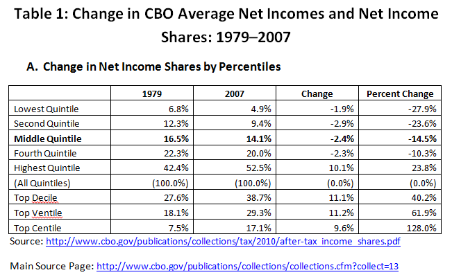
A different but related question: Instead of looking at average incomes, what happened to each quintile’s share of the pie over the years? The CBO publishes data on the shares of net income, which are reproduced in Table 2. The answer is truly staggering. All of the bottom 80 percent of households – four out of five households – received a lesser share of total income in 2007 than they did in 1979. We might expect the bottom quintile share to fall, but the fact that the broad middle class (from the 20th to the 80th percentile) all have lesser shares of income now than in 1979 is truly amazing and may well underlie the frustration of the middle class’ attempt to get ahead in America. After all, many analysts ( for instance, Rampell, 2011) have shown that real income growth for couples over this period is due to added work hours and not rising real wages. The middle quintile that Burkhauser might favor has lost 2.4 percentage points in their share over this period in Table 2. The top 20 percent of the distribution now gets 52.5 percent of the net income pie, and the top 1 percent now get more than the bottom 40 percent combined (17.1 percent vs. 4.9 plus 9.4 percent). Figure B shows how these measures changed year to year over the same period as the Burkhauser estimates, showing how the gap in shares played itself out. Since 1995 the patterns changed systematically and the gap between the bottom 80 percent and the top 20, 10, 5, and 1 percent began to grow.

IMPLICATIONS FOR THE INEQUALITY DEBATE
Pundits who have read the longer version of Burkhauser, et al. (2011) argue that the middle class is actually doing pretty well. But after this comment, the reader might get another and a different view of what has happened to the 'middle class' over this period.
What is the moral of this story? In income inequality debates, do ask the right question, as Burkhauser argues. But then use the right data and shine the spotlight across the whole distribution, not just the ‘average’ household3. If one does so, they get a very different view of what is going on in terms of whose incomes rose by how much, and who gets what share of net resources as well as the tax, transfer, and regulatory policy implications they convey.
—TIMOTHY SMEEDING is the Arts and Sciences Distinguished Professor of Public Affairs at the University of Wisconsin–Madison. He is also the author of the forthcoming RSF book, Persistence, Privilege, and Parenting. IRV GARFINKEL is the Mitchell I. Ginsberg Professor of Contemporary Urban Problems at Columbia University and a former RSF Visiting Scholar.
REFERENCES:
1: They also ought also to be adjusted for the quality of employer insurance and underinsurance, for the uninsured as well as the underinsured, and so on. But here reasonable people may differ on the methods and that is beside the point for this short response.
2: It appears that Burkhauser adjust all incomes for household size and then adds on medical benefits, which are not adjusted for family size but are per person or per household. Presumably this is because medical benefits have a different household size adjustor ("equivalence scale") than does other cash income. The CBO (2010b) deals with this issue and others by ranking all persons by using adjusted income only to rank persons and households in the income distribution, and then uses values for income that are unadjusted for household size within each income grouping. We do not feel that these methods produce major difference in outcomes at the median. Since no distributional data is contained in the Burkhauser web entry, we cannot be sure how much difference this makes across the entire distribution.
3: To be fair to Burkhauser, his longer paper (Burkhauser et al., 2011) does present distributional estimates for the average person in each quintile (but not the income shares by quintile). In these estimates (Table 4, panel D, page 35), the level of incomes rises by the following percentage points due to heath care alone: 11.4 percentage points in the bottom quintile, 7.4 percentage points in the middle (exactly what he shows in Table 1 on his blog post), and 3.4 percentage points in the top quintile. Hence, the rise in the benefits of health insurance are a much larger percentage of income at the bottom than at the top of the distribution.
Burkhauser, Richard V., Jeff Larrimore, & Kosali I. Simon. 2011. "A 'Second Opinion' on the Economic Health of the American Middle Class." NBER Working Paper No. 17164, June.
Congressional Budget Office. 2010a. Average Federal Taxes by Income Group. June.
Congressional Budget Office. 2010b. Issues to Consider for Distributional Analysis.
Piketty, Thomas, & Emmanuel Saez. 2003. "Income Inequality in the United States, 1913–1998." Quarterly Journal of Economics. 118:1, 1–39.
Rampell, Catherine. 2011. "Rising Family Income: More Work, Not Raises." New York Times, July 20th.
Recent Books